BRANDING
Alma emerged from the collaboration of two brothers, ÁLEX and MARC, committed to upholding the family legacy of crafting traditional desalted codfish.
Derived from the first two letters of their names, the brand encapsulates their profound dedication to the codfish world.
Their upbringing in the family enterprise has endowed them with profound expertise. Infusing their traditional craft with a dash of contemporary flair and avant-garde ingenuity, they continue evolving in the business.

Packaging
Merchandise
Brand building
01
02
03
Social media
04
Visual language
05
01
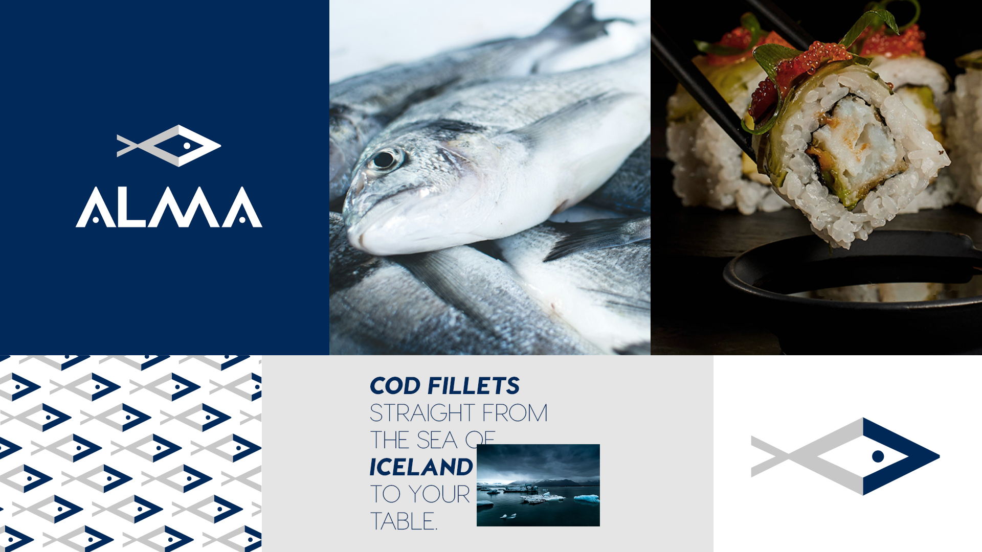
The logo is the visual representation of ALMA brand. It is made up in two parts: the isotype, which is the symbolism of a codfish, and the name, which comes from a typeface that has been geometrically personalized to be unique.
02
ALMA's visual identity lends itself to playing with the symbol as a pattern and with the contrast of its colors they form an ideal combination for branding.

03
The packaging had to be waterproof and resistant to low temperatures, with a window so that the product can be appreciated. We played with its colors and patterns to give a modern and dynamic image.

04
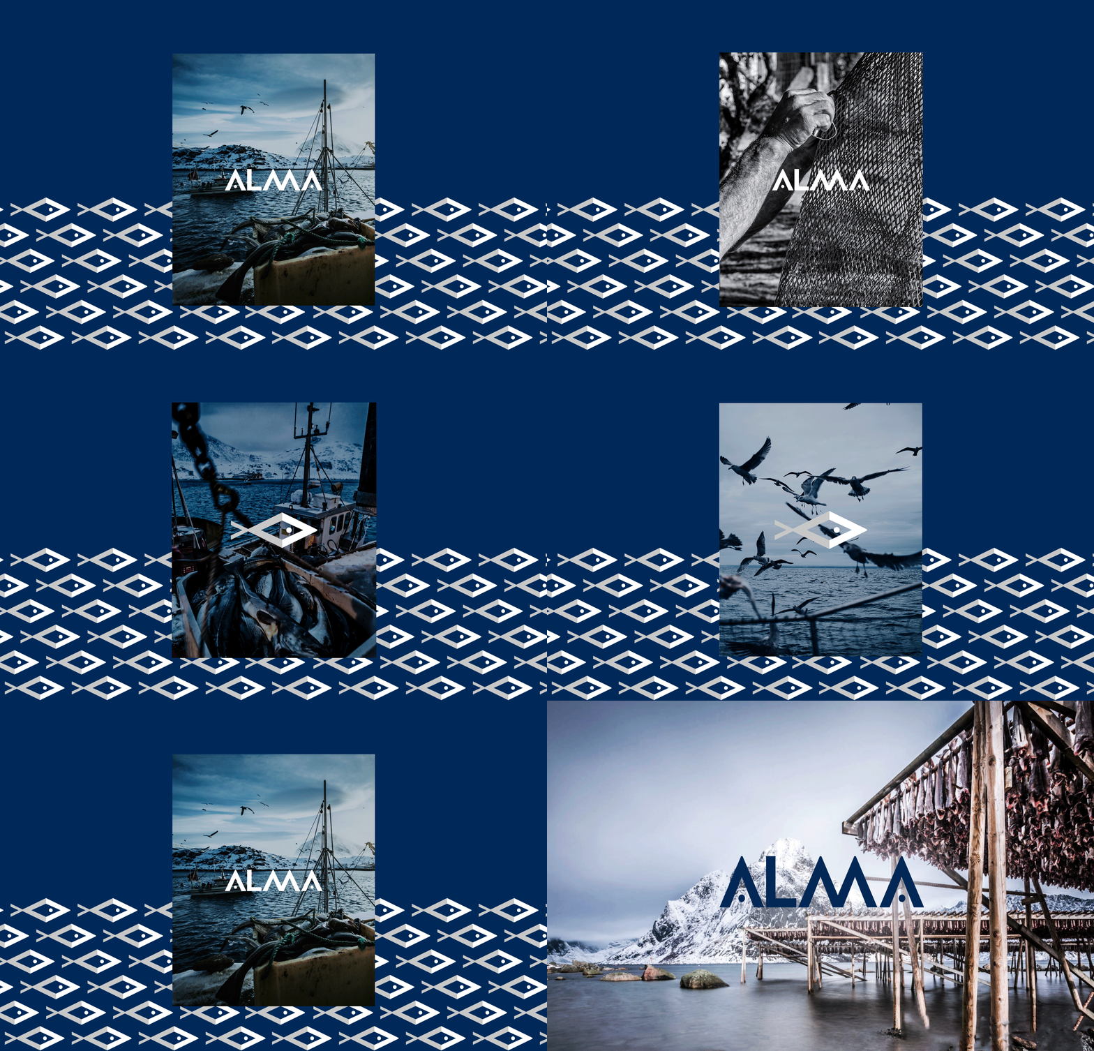
For social networks communication, it was proposed to play with desaturated photographs of the product either in its original context, raw or served on the table, along with short and clear messages that talk about ALMA.

05
ALMA's visual language is basically playing with pre-established patterns and colors, with desaturated but natural photographs that communicate its origins.


